Direction & Goals
Direction & Goals
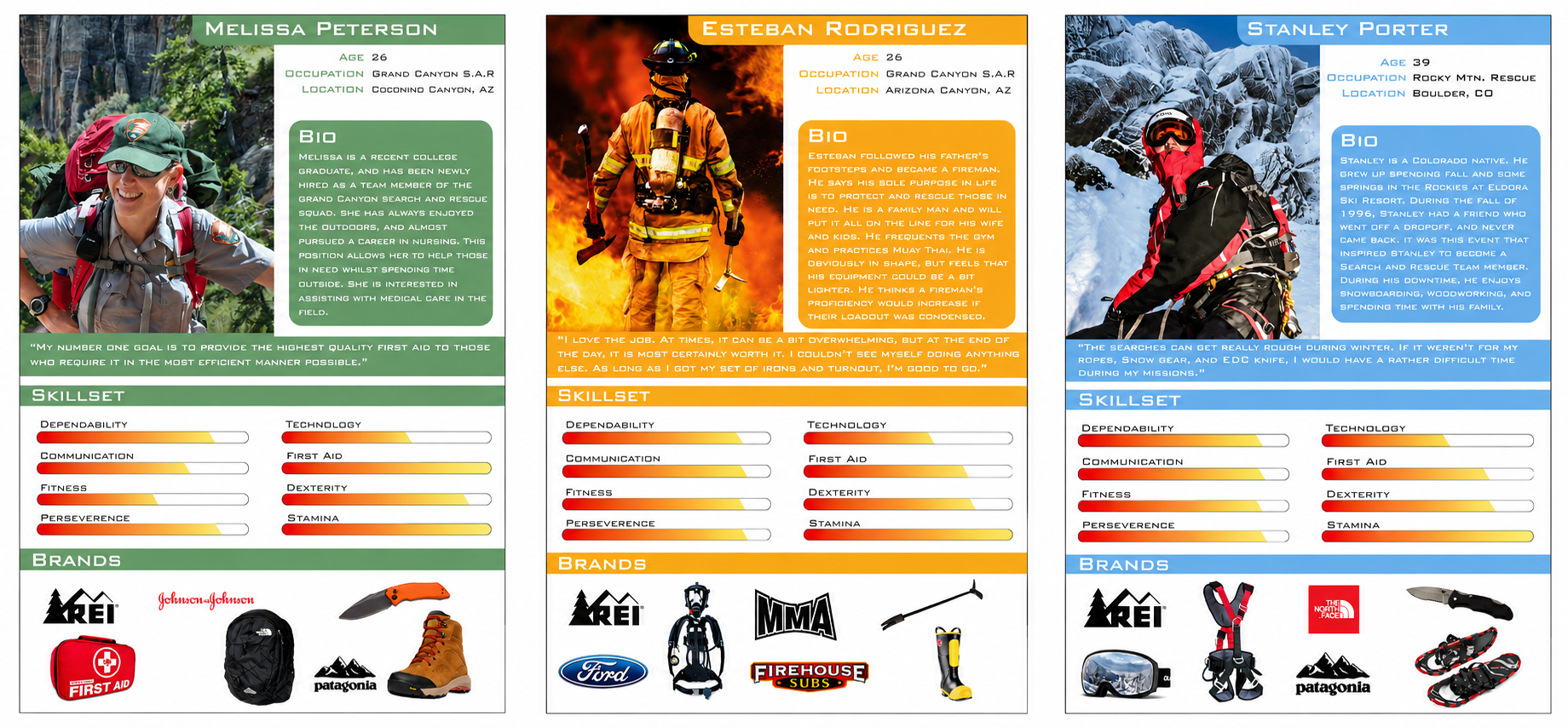
User personas were created to get a clearer understanding for who I was designing for. These three personas consisted of three different types of emergency responders, with those being dry mountain search and rescue, snow terrain search and rescue, and the standard firefighter.
Each group performs similar jobs, that being searching for lost or trapped peoples. Though, the environments in which they perform these task are highly nuanced, and each group requires different products and tools to assist them in their search.
With these personas, I could then begin to conduct interviews and identify user pain points and uncover key insights.
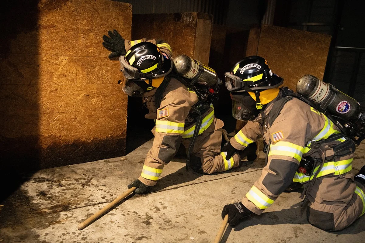
The number one priority for emergency responders is to locate and secure their client in the shortest amount of time possible. Search and Rescue missions usually last anywhere between 3 and 14 days. Search parties ranging from 30 to 100 traverse through various terrains and conditions while wearing an ensemble of rather bulky gear for multiple days.
To equip the average search and rescue individual with the lightest and most essential equipment possible is the ideal situation. The goal is to have a loadout that promotes less fatigue. Search and Rescue team members perform their duties at the highest efficiency when they can move around freely without becoming encumbered. This same logic applies to firefighters as well.
The goal of this research is to determine what tools are necessary for emergency responders to carry during their missions. It is obvious that the more one loads upon themselves, the more weight they will have to bear. Bearing more, and potentially unnecessary weight will read to more rapid fatigue. This will then slow down the search party, causing substantial time loss, when time is the most precious resource in these scenarios.
User Personas
User Personas
Integrated Innovation Model & Key Insights
Integrated Innovation Model & Key Insights
Iterative Sketches and Preliminary Models
Iterative Sketches and Preliminary Models
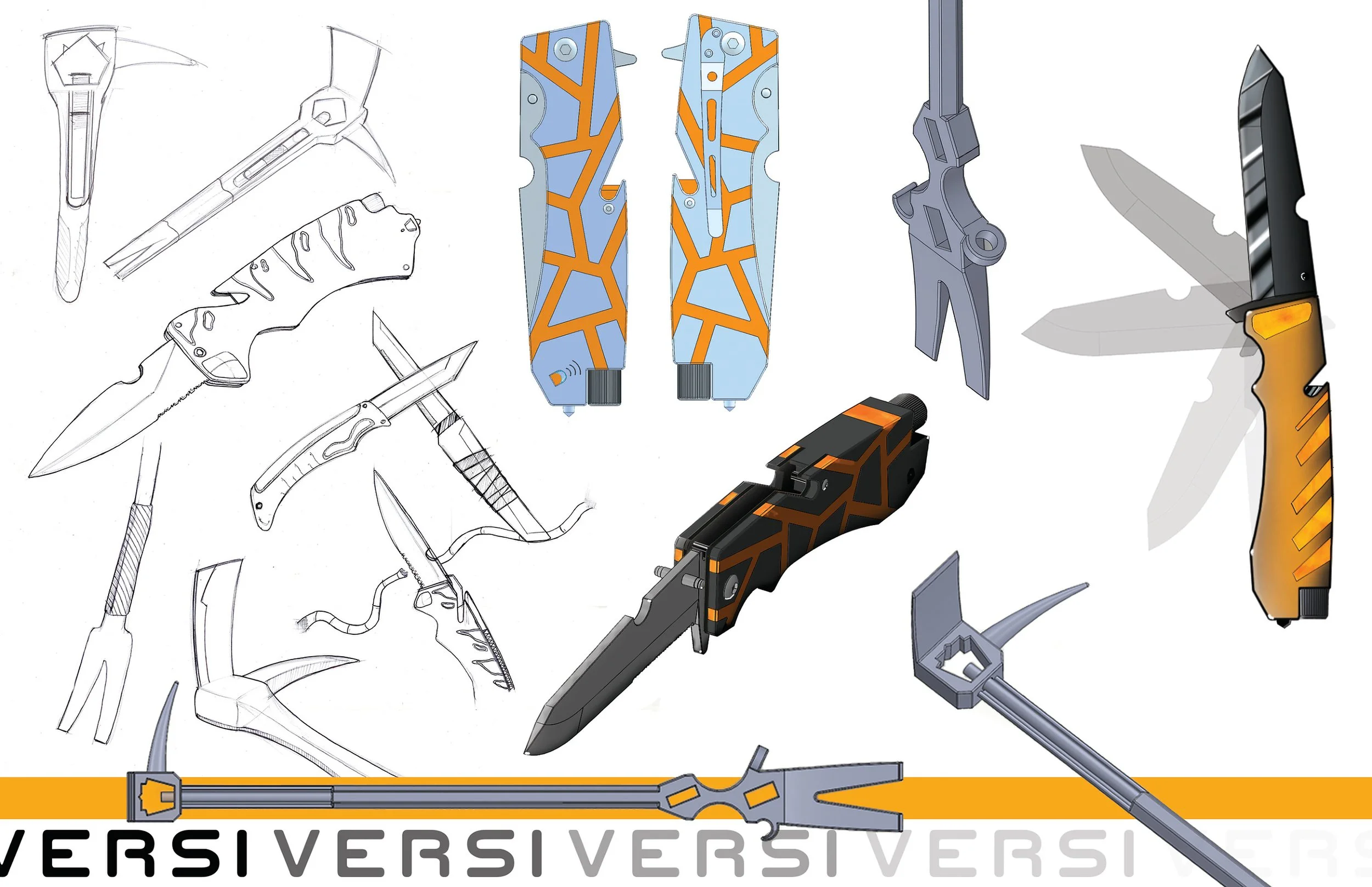
Once the brand and product direction was solidified, the actual design process could begin. This consisted of iterative sketches and models to gain an understanding of form. Mediums ranged from pen-and-paper sketches, illustrator renderings, and Solidworks models. With multiples forms explored, I was finally able to choose two forms for two distinct products, an EDC (Everyday Carry) Search and Rescue Survival Knife, and a re-imagined Firefighter’s Halligan.
Final Designs
Final Designs
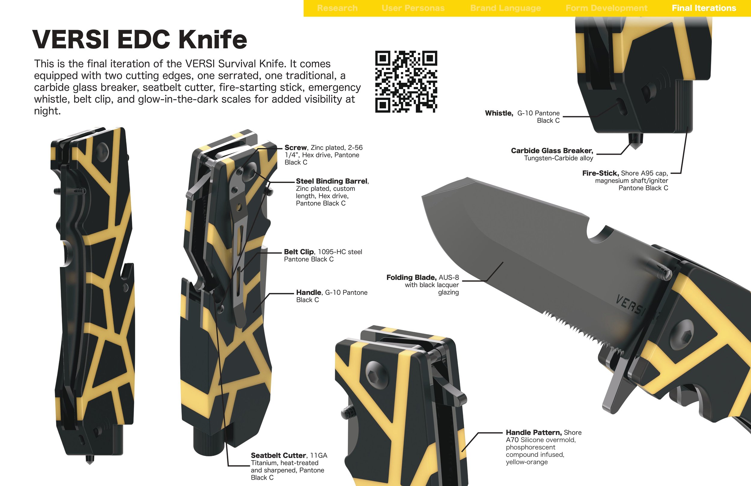
This is the final design of the EDC Survival Knife. It is primarily designed for search and rescue team members, but campers, backpackers, laborers, and even 9 to 5’ers could benefit greatly form this EDC knife.
Its sleek, compact design includes an AUS-8 folding blade, with serrated edge included for sawing. It safely fastens to any belt with its 1095-HC steel clip. It also features a whistle to alert others to your position for whatever reason, a carbide glass breaker, seatbelt cutter, and a compact, magnesium fire starter. Lastly, the orange overmold on the knife’s body glows in the dark, so that search and rescue teams can easily identify one another if light sources run out, or they can locate the knife if it happens to fall out of the users hands during use. This is a knife for specialists, and those who love to be prepared for whatever life hands them.
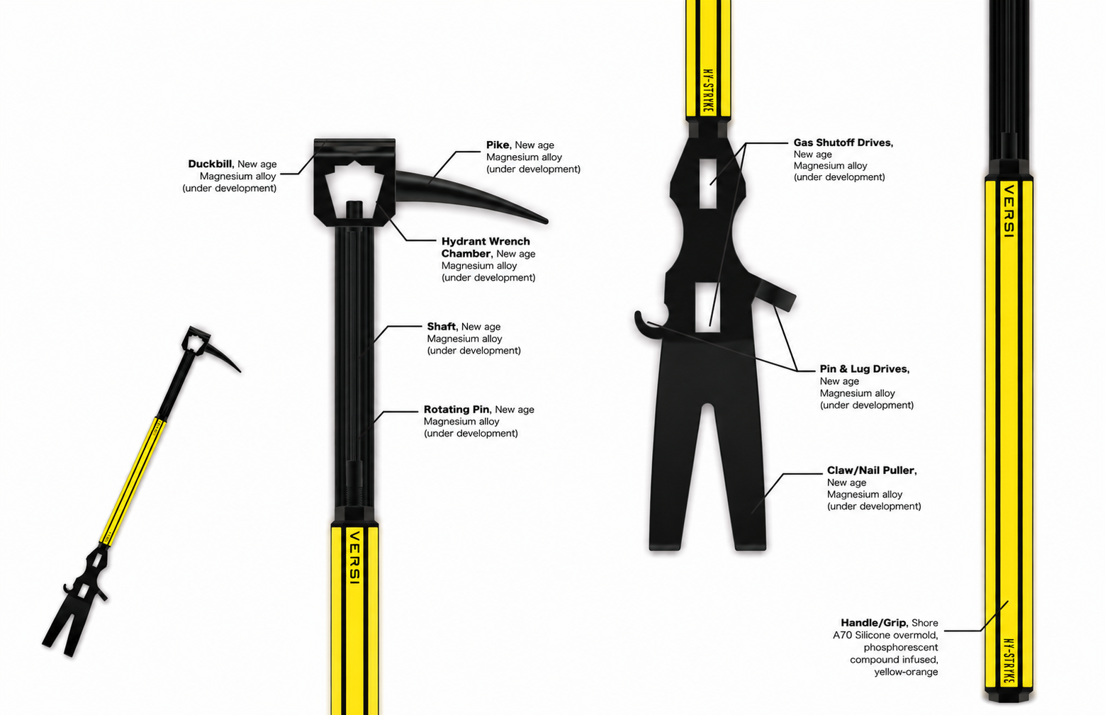
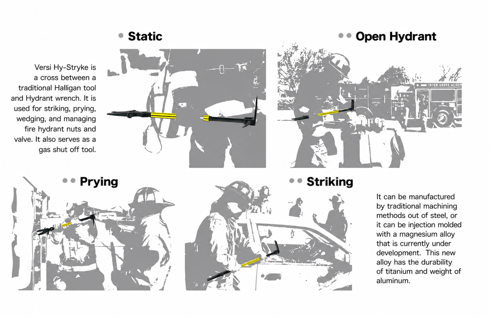
The final product in the line thus far is the Versi Hy-Stryke: a firefighter’s multitool. It’s base design is that of a standard Halligan, which is used for forcible entry, breaching, utility control, and other similar uses. This design takes that utilitarian functionality a step further, by adding fine-tuned gas shutoff drives, pin and lug drives for fire hydrants, and a hydrant wrench addition, so less tools are needed to be carried and accounted for on a firefighter’s already cumbersome and limited arsenal. Lastly, the Shore A70 silicone overmold glows in the dark, for the same reasons as the EDC knife. The goal of this product was to take a firefighter’s loadout of tools and consolidate it as much as possible, and I personally believe it achieves that goal. Future steps of this project include building prototypes and presenting them to those interviewed to see if their pain points have been alleviated.
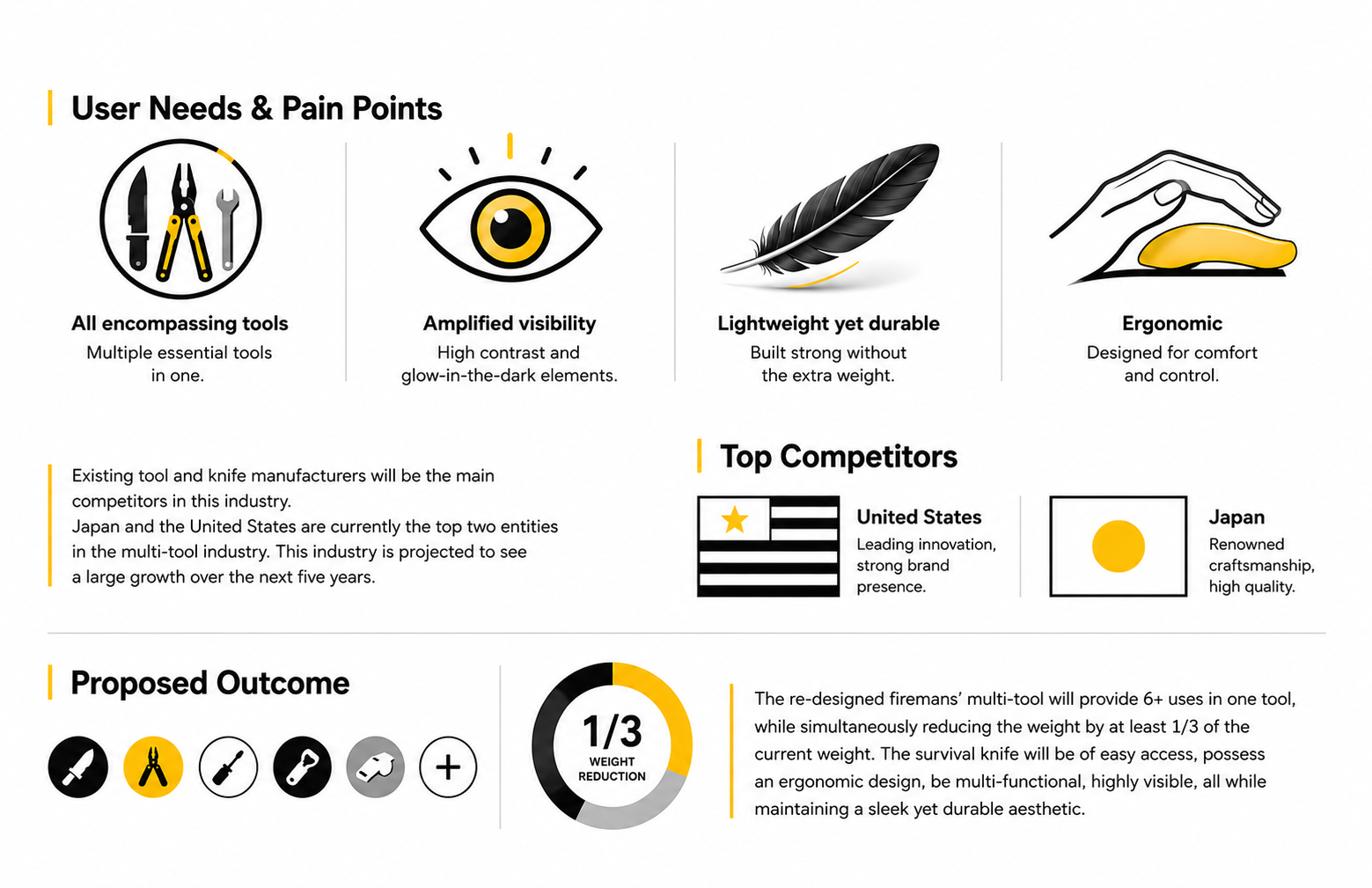
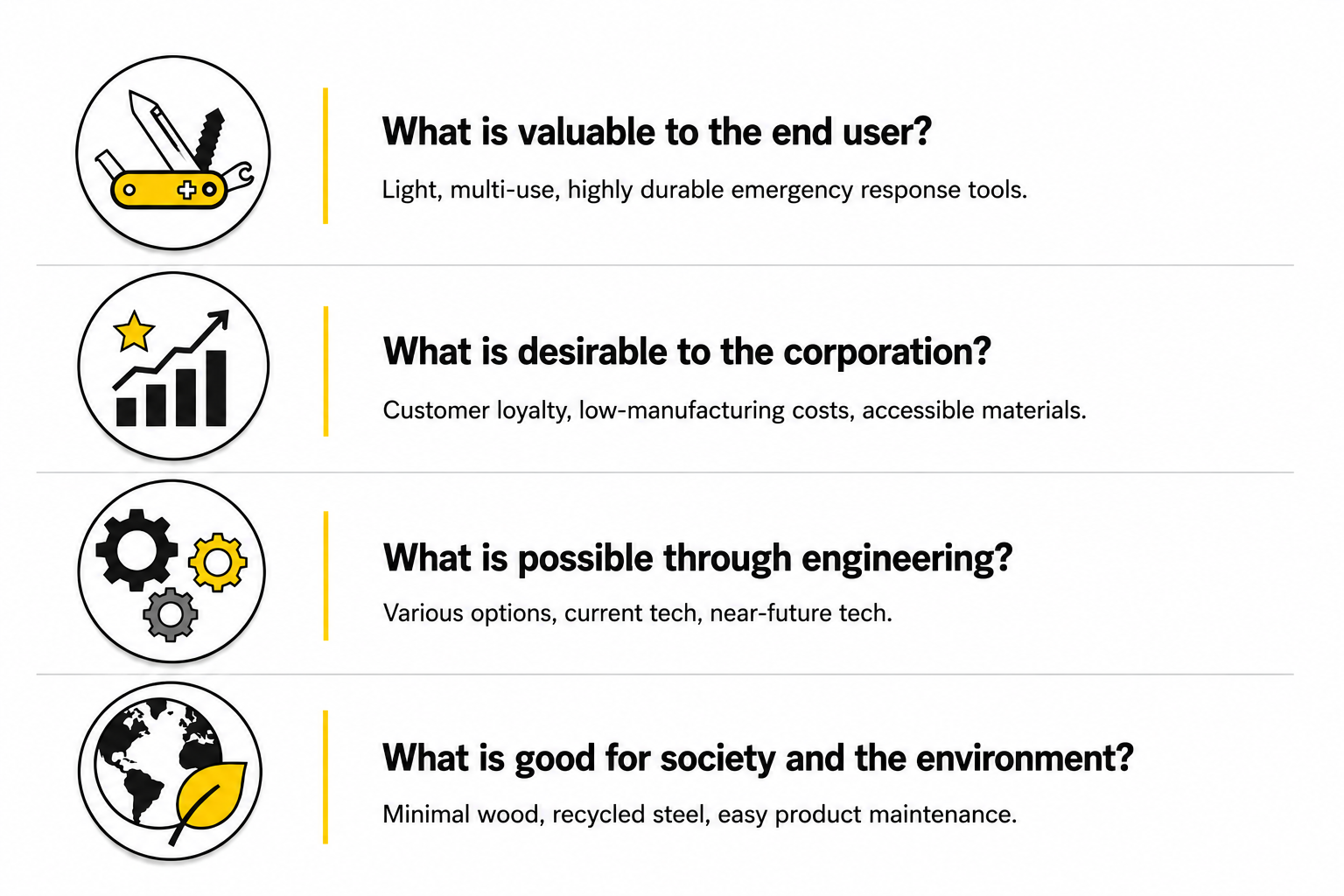
After conducting user interviews, an integrated innovation model was generated to identify the potential value for all parties as it relates to new emergency response tools. User needs and pain points were also accounted for, and will be the main focuses of the designs to come.
Branding Exploration
Branding Exploration
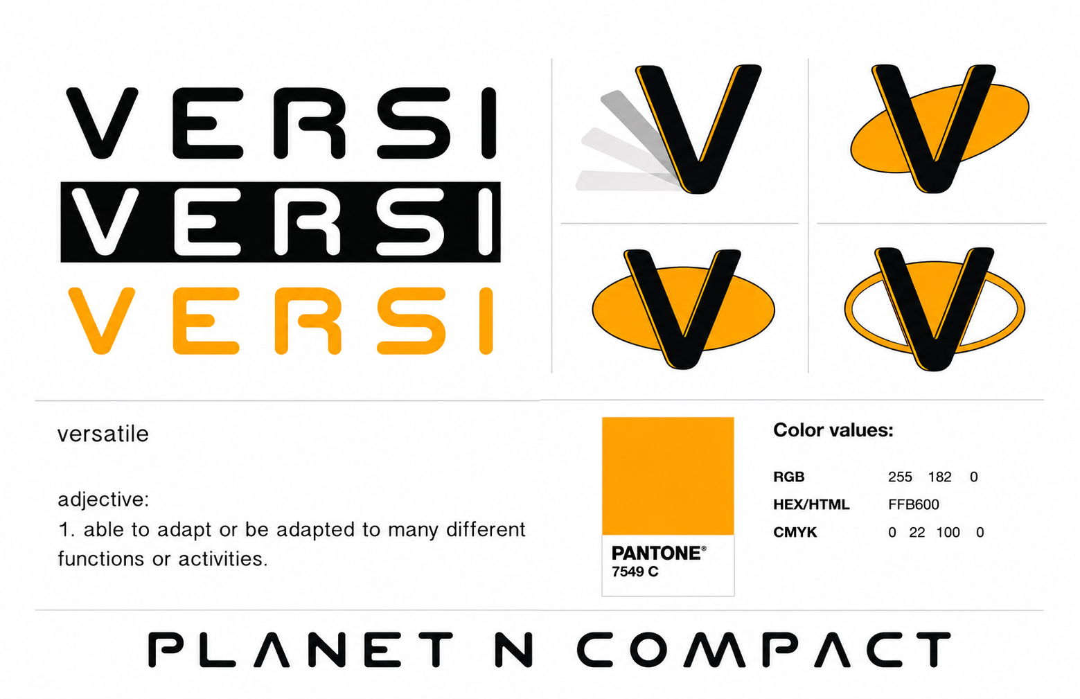
A simple brand guideline was explored as a creative exercise. I wanted something simple, yet bold. I chose to go with a stark color code of black, white, and orange, specifically Pantone 7549C. This is simply the brand color, though not all product need to adhere to said color scheme. The font is contemporary, but evokes a higher-tech feel with the sans-serif, sleek, rounded font. After much brainstorming and consideration, the brand name, VERSI, was decided upon. The name VERSI is simply a shortened form of “Versatile”, meaning to have many adaptable functions. This encapsulates the entire meaning of the product line into a single, concise, memorable word.